About

My photo
This blog was established as a place to share my design finds, work & inspiration. This blog provides a creative outlet to share my thoughts and inspiration for all things design. I hope this blog inspires you. Visit our website www.winkandco.com.au.

Tuesday, April 16, 2013

Clever Ideas to conceal a television

The beloved TV has become a must-have that many of us can’t live without in our homes. Over the years we have watched the humble TV evolve from small to large and more recently from bulky to ridiculously thin! In the same fashion we have witnessed the way that we incorporate televisions into the design of a room also change.  
We are midway through a job involving re-designing a living room for some amazing clients. One of their biggest requests for the new design was the ability to conceal the TV when it wasn’t in use. The appeal of being able to camouflage TV’s so that they don’t take centre stage in a room is becoming more and more popular.
These days there are so many options available for disguising televisions. From clever custom cabinetry that integrates the television to make it less conspicuous, to making it disappear altogether – the degree of disguise is up to you.


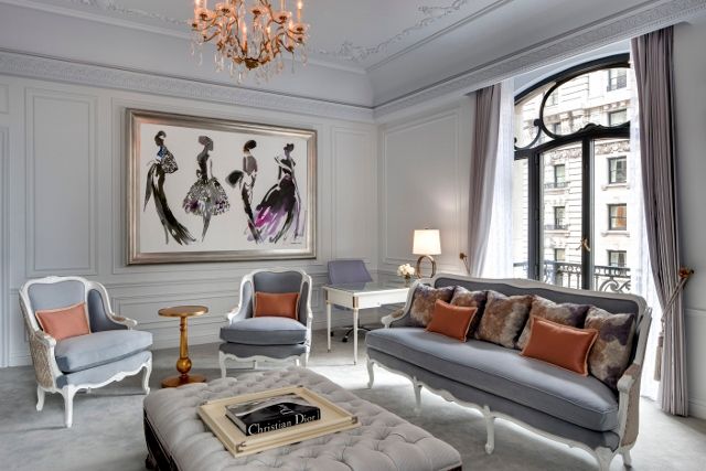
If you’re not looking to conceal the TV completely, less emphasis can be placed on the television by avoiding making it the focal point of the room. A wall of picture frames strategically placed around the TV achieves this beautifully. 


A painted black wall helps a TV disappear 


Curtains provide a soft and tactile way to hide a TV when not in use - simply pull them across and know one would ever know what lies behind


Two-way mirror TVs are a glamorous choice


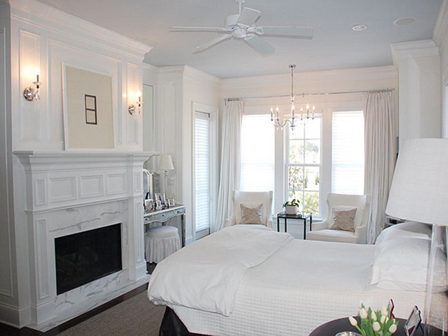
TV cabinets or wooden cupboards like this are a functional and aesthetically pleasing option that work particularly well in living rooms or bedrooms


The ultimate alternative to make that TV disappear...custom cabinetry that slides to reveal that glorious TV

images via pinerest

Monday, April 1, 2013

Visual Inspiration

After a few well deserved days off over the Easter Break we are feeling relaxed and refreshed.  Bring the rest of the week on!

Due to our relaxed and zenned status this post will feature minimal words and plenty of visual inspiration to start your week. Enjoy!


all images via Pinterest


Monday, March 11, 2013

Dior at the St Regis


How fabulous is the St Regis, New York. 

After their collaboration with brands such as Tiffany & Co and Bentley, they have partnered with Dior to create an iconic Dior inspired suite. And who doesn't love Dior? Inspired by the Parisian atelier this stunning suite is ultra feminine and incorporates subtle signature elements of the famous brand. Muted shades of Dior grey blanket the room and soft furnishings feature the traditional Dior motif of roses. The amazing watercolour artwork is a tribute to Dior's glam take on fashion and is by artist Bil Donovan.  

This is one chic hotel that is quintessentially French and drips with glamour.


The view from the living room - stunning.


What an entrance - simple and classic.


The traditional dining room which comfortably fits eight on these exquisite Louis chairs.

Floorplan.


Images via St Regis

Friday, March 8, 2013

All-white Interiors

Within the interior design industry there is always deliberation over the use of colour in interior design. One consistent topic of debate is the use of the classic 'all-white' interior. I will probably be shot for saying this but....I love an all-white interior (there I said it)! Many people feel that white interiors can be dull, clinical, stark, and boring. And I must agree - some white interiors are all these things. However, white done right is second to none.


White interiors are flexible and very forgiving - particularly in older houses as white walls have the ability to hide a multitude of sins. An all-white interior (if done properly) can be cozy, modern, calming, luminous and bold. White walls and floors make borders disappear and rooms feel larger.

If you are thinking of creating your home on a base palette of white or designing an all-white space, here are some tips to help you get it right.

Pick the right shade

White comes in a multiple of shades and the first step when designing is deciding which white is right for your space. Whites can be divided into two categories: cool whites and warm whites. Cool whites generally have a subtle blue or green undertone. Blue-based whites can be difficult to work with as they can often appear clinical. They do however work well in north-facing rooms with an abundance of light.  Warm whites on the other hand have a subtle yellow or red undertone. Warm whites are great for country-style and heritage interiors as they complement timber finishes and traditional colours such as duck-egg blues.  

Here are Wink & Co's favourite white paints:

Cool Whites
Dulux, Lexicon
Porters Paints, Milk
Dulux, White on White
Dulux, Whisper White


Warm Whites
Porter's Paints, Long grain
Taubman's, Plain Vanilla
Dulux, Chalk USA


Choose A Variety of Tones

Next, make sure you mix your whites up a little. Don't make the mistake of filling a room with everything in the same shade of white or you will end up with a room that looks like a snow bomb has gone off. This home (click here) is my favourite example of how not to use whites in the same shade (it cracks me up every time - even the dog is white)! Choosing furnishing and objects in several slight tonal variations will avoid your room looking stark and clinical. 

Texture

Lastly, but most importantly - texture. Layer lounges with throws, blankets and cushions in different textures or add a rug. A good ratio of hard to soft surfaces is the key to making a room feel comfortable and balanced. 

To wrap this up - below are some fabulous white interiors that  demonstrate white done right.


all images via my pinterest.

Tuesday, March 5, 2013

Thank you Home Beautiful Bathrooms Magazine

We are incredibly humbled to have our ensuite featured in the 2013 edition of Bathrooms (The Ultimate Bathroom Renovation Guide) Magazine. This gorgeous magazine is bought to you from the team at Home Beautiful. The ensuite images are from our feature in Home Beautiful's "50 most beautiful rooms" special in their October edition last year.


Our ensuite is one of my favourite rooms in the house. The stained-glass bay windows and decorative plaster ceilings were our initial starting point when designing the room.  We wanted to incorporate these heritage pieces into the design but with a few modern touches.  Like the rest of our house it is a meticulous blend of old and new. 

The crystal chandelier (which unfortunately you cant see in the photos except a few strands on the third page) is the focal point and feature of the room. The effort that went into purchasing it and having shipped up from Sydney was an absolute nightmare but well worth the effort. Twin basins, an original clawfoot bath, a custom vanity clad in metallic gold finish, metallic wallpaper and a spacious open shower all add to the glamorous feel of the room. It is the perfect room to relax in after a long day!


and some behind the scenes shots from the photo shoot


Thank you to Home Beautiful for including our bathroom in this year's edition - and a special mention to the very talented Tahn Scoon (stylist), John Downs (photographer) and Jane Parbury (editor - and who wrote the copy for the article). 

For anyone who is looking to renovate or design a bathroom be sure  to gran yourself a copy of the magazine which went on sale yesterday.

Monday, February 25, 2013

Iconic Kitchens

Here at Wink & Co we are midway through an intense kitchen design for an amazing client. Given my love for entertaining I love the opportunity to design kitchens. Apart from being stylish and functional we love to add a little ‘pizzaz’ to our designs to prevent them from being too generic.  We all like a little something out of the ordinary don’t we?

Elle Decor recently released a One-of-a-kind Kitchen special (you can read it here) with 25 creative kitchens. Here are our favourites.


Image Source: All images via Elle Decor

Thursday, February 21, 2013

Bathroom Heaven

It isn't often that a design, stops me in my tracks but this bathroom was the exception. It has been in my inspiration files for a long time and each time I come across it takes my breath away. It is the bathroom of one lucky celebrity, I can't remember who(Sarah Jessica Park rings a bell). 


Glossy white floors, artwork, greenery and soft tactile finishes make this the ultimate bathroom. Don't you just love??


Image source: I'm so sorry, I have no reference where this lovely image came from. If anyone knows please let me know.

Design Dilemma

Its official - I am facing a design dilemma. No, make that a design crisis!

Yesterday I returned home after a long days work at the office, walked in to our empty house and heard the sound of music greeting me as I entered. What on earth, I thought. Have we been burgled by a music loving burglar? As I crept into the living room I was soon greeted by possibly the most hideous monstrosity that has ever set foot in our house - a vintage record player and radio. Now, I'm not just talking about some gorgeously stained timber piece of beauty here, no, I am talking gigantic, in-your-face, cant miss me - record player with two over sized speakers to boot!

Steven is a lover of all things retro (I think he was born in the wrong era) and has been hankering for a record player to play his vintage record collection on for many months now. We have argued about the style, size, look of what he should get (I would have been happy with the invisible kind) and most importantly where the hell it will go! Which brings me to my current predicament now that this record player has magically appeared in our home - where to put it?

Interior design is all about translating the tastes of two people (or one or more in some cases) into one functional and harmonious design. Steven and I flounder between loving the same things and at other times being polar opposites. He wanted a rug made from artificial grass for his office, I would have preferred a hand-knotted silk rug for a more luxurious feel. He loves ultra-modern and I love classic.  It can be very hard at times to unite two people's styles and personal tastes into a successful design - but that's what our jobs as professionals is for! So while I sit here self-pitying the predicament I find myself in, I really should sign off now and put my time into finding a solution and vacant position in the house for this new permanent fixture. This needs a lot of thought!


The offending piece of equipment in question


Ok, this last photo looks half decent and quite modern I must admit.

Wednesday, February 13, 2013

Rapp Scarves

I recently came across the work of Melbourne textile designer Eloise Rapp and her amazing label Rapp.

A lover of all things beautiful, Eloise works unusual colours, evocative prints and sublime textures into her stunning scarf designs. Not sure if is just me but I can see some parallels between Rapp's latest range and the work of well renowned interior designer Kelly Wearstler.


While these bright colours and abstract prints are perfect for tying around your neck or head, at one full meter square they are perfect for framing and creating unusual pieces of art for your walls.


Not convinced? Here is some framed scarf inspiration to help convert you.


These gorgeous Hermes equestrian scarves make a stunning wall display. 


Beautiful vignette


Bold, graphic prints make this hallway a winner


Simple yet striking


image sources: 1. / 2. / 3. / 4.

 
Powered by Blogger.